6 Key Design Lessons from a UX/Sales Perspective (website included)
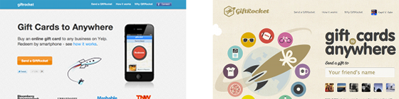
3 Weeks ago there was a post made about 6 key lessons from a legend designer. First and foremost I am writing this article in hopes that start ups can take away that you can make a nice looking website that focuses on sales rather than aesthetics. I have nothing against the person who redesigned Gift Rocket’s site or Gift Rocket themselves. I think they are all wonderful guys working on a pretty interesting project but unfortunately did not really get any advice to take away or build upon after displaying their redesign. I hope this post will change that.
Here is a link to my version of the redesigned website
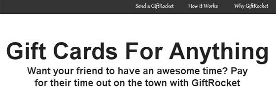
- Use Clear Headlines and Subheadlines One of the biggest mistakes people make is not clearly stating what their product or website does immediately to the user who has just opened your page. The majority of people elect to use ‘fancy’ marketing headlines that leave you more confused rather than influenced. Business type websites seem to have a knack for not just getting to the point, using color words. Here are some examples of what not to do:
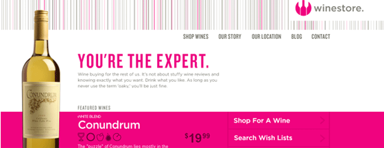
I’m the expert…Perhaps at choosing wines? Tasting wines? I’m probably far from that. Even after reading the paragraph below I still am not sure why I should buy wine from this site rather than all of the other sites. There is no clear value proposition or description of what makes this site great. A better headline could have been “Get wine you’ll love without being an expert”
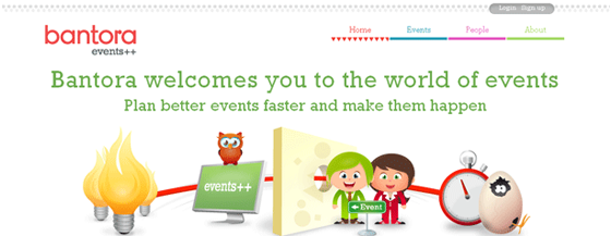
Here is one that almost has it. Their sub-headline makes for a great headline. “Plan better events faster and make them happen.” This gives the user a very clear idea on what the product may be. It also draws them into the ‘would be’ sub-headline which can consist of bullet points or a paragraph that describes clearly how the product will solve the users problems.
Finally my favorite:

Here are some good examples:
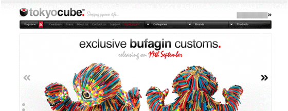
Even though the headline is short, it is so clear and concise that people don’t have to wonder why there are a bunch of thumbnails of art all over the site and subtly figure it out overtime.
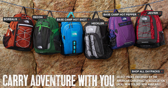
The North Face doesn’t place its headline visibly, it places the adventure and product in the spotlight anticipating that the user will scroll down to get a better view. Then they use a headline that works mainly because of the picture. North Face is does an excellent job on selling the user on the experience, adventure, and all the fun you could be having if you owned a backpack. Their sub-headline taps into the ‘do gooder’ part of the brain. It has its positives and negatives. Positive being it somewhat helps users feel even better about their purchase but negative in some eyes because it may come off as ‘abusing’ a charity organization’s message for the sake of profit.
I chose a prominent headline and sub headline with plenty of white space.
Looking at the headline alone doesn’t completely explain the product but the objective of the headline and sub headline is to bring clarity and draw interest into the next part of the site. This is where the large mobile phone and how it works section helps cure the users curiosity as to what the product is or how it works.
- Use images that help explain your product
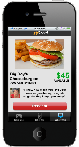
Half of this image is prominent once the user opens the browser, it’s usually the next thing they will look at once they read the headline. This image shows the product in all its glory with its bare essentials. This should help the user further understand what the product is and begin to educate them on how it might work. While doing a ‘usability’ test with my mom, I found that with just the headline and picture alone she was encouraged to buy and look into the product more.
- Know your audience (as cliche as that may be)
When thinking about the design and usability of your site, your user/audience should be your #1 motivator. For this product, I would guess that females and perhaps older adults were more likely to use this product. Aunts, Grandmas, etc. were a target audience I thought about while doing the design. You’ll notice that the text is fairly large (with a base font of 16px) and contains plenty of bold headlines. This is to encourage easier to read text, and paragraphs that might not feel as daunting compared to their 12px counterparts.
- Background Color Transitions / Layout
I consider this site to be set up like a short form sales letter. It takes you through a natural progression of educating the user → banishing any user doubts → selling. You might have noticed as you scroll through the site that it goes from a white background to a black background back to a white background. Very subtly this tells the mind that something has changed, this isn’t just an ending flow of information and their might be something interesting to look at in this section. Not too many websites are able to employ this technique due to their focus on consistency and lack of long pages. Here is one example from IntuitionHQ uses this technique with their forms.

The next time you find yourself with long sections on your website/webapp consider using color transitions to subconciously hint to the mind that things are changing/a progression exists.
- Social proof – Using faces/brands your users can relate to
Accolades and testimonials are the best ways to crush user doubts about your product. That is the main reason I placed them underneath the first attempt at getting the user to search for businesses to buy giftcards for.
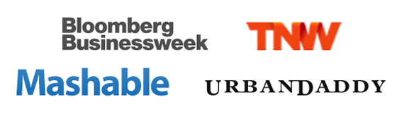
These serve mainly to present credibility and legitimacy since purchases will have to be done through the site. The biggest drawback of these accolades though are who they are from. If we think of our target audience/personas a majority of them probably don’t know what Urbandaddy, The Next Web, and Mashable are. Given the startup environment, it’s hard to have accolades from anyone, so anything helps.
Everyone knows your customers are your best salesmen. However when it comes to testimonials, I am still surprised that a majority of people are doing it wrong or could be doing it better. Testimonials should resonate with your target audience, they should be able to place themselves in the person who gave the testimonial’s shoes. This is why it is extremely important when asking your customers to give testimonials to give them good questions to answer and have them tell a story. What was life like or your pain point like before this product? How has this product changed that? What value did this product bring? Can you imagine doing things the way you did them before you knew about this product? Use a variety of people, young, old, male, female, etc. Again you are trying to appeal to your target audience.
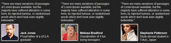
Pictures help users relate even more to the testimonial. Users resonate with things like ethnicity, sex, age, anything they can find to say “Hey that person is pretty much like me.”
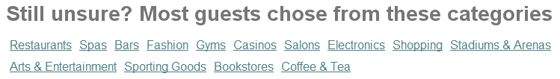
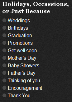
- Give user’s hints on where the product can be used
When was the last time you pondered buying some one a birthday present? What about a Christmas gift? Wasn’t it hard to figure out what you should buy them?
While testing the site my mom tried to click the (disabled) Need a suggestion link. Ultimately users aren’t sure what they want to buy, but they buy experiences and ideas, it’s up to you to influence those decisions.