Healthy cooking web app concept
Food photo credit: Munchery Blog
The fundamental goal I kept in mind when designing this was “How can I find good/healthy recipes to cook.” I researched several sites and found what they lacked in and what they were doing well. Considering all of the sites, the discovery process was the weakest. Having the Twitter 1 way follow method can be a good way to enhance the content discovery on a website.
Key Lessons:
- Double tabbed navigation for clean information architecture
- Two column layout
- Leading content discovery w/ scrolling
- Green buttons vs orange buttons
- Website theme colored links vs standard blue
- Thumbnail context and layout
- Double tabbed navigation for clean information architecture

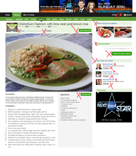
Having 2 sets of navigation can get confusing. Tabbed navigation contains subtle hints to show which information belongs to what. It is a very good way to hint at how users can organize information to help them find the categories they are interested in.
- Two column layout
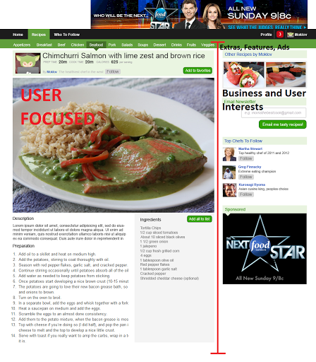
I am a firm believer in 1 or 2 column layouts. It is very rare to see 3 column design done well. Most use the 3 column design to repeat features or navigation. From a user first standpoint, this app would work fine with a one column design. The primary goal of this page is to show the food, ingredients, and how to cook it. Once we start to account for engagement, discovery, and how to make money, the layout becomes more complex. Engagement and discovery play 2 big roles in any web app. The more we can engage users to relevant content, the happier they will be, the more they will use our product, and the more opportunities we will have to monetize our service.
These are the several points where the app tries to improve engagement and discovery. Even though there are 10+ opportunities, the only 1 that engages offline is the email newsletter. That’s why it’s so important that the products primary goal achieves what the user wanted and felt so good that they would want to do it again.
- Leading content discovery w/ scrolling
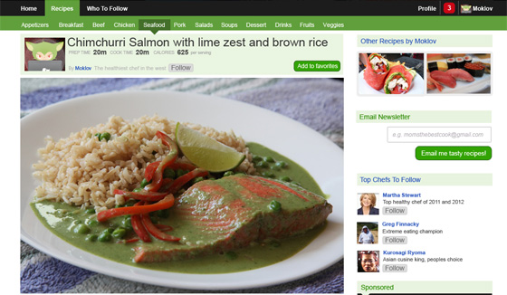
Once a user clicks to this recipe, this is what shows above the fold. The users eyes should immediately be drawn to the food, this will let them know that they are on the right page and are about to get more info on the recipe they selected. The image appears to be cut off as well as ingredients/instructions not readily available. This forces the user to scroll downwards and engage more with the content the site displays. If the page had a smaller picture, it would feel overcrowded and disrupt our opportunity to promote more areas on the site.