How to prevent visual flow interruption with gradients
How to prevent visual flow interruption with gradients
A lot of designers use lines of varying weight to differentiate content. These are instantly recognizable by the user but can get out of hand if used too often, and with too much weight (dark lines vs light gray lines.)
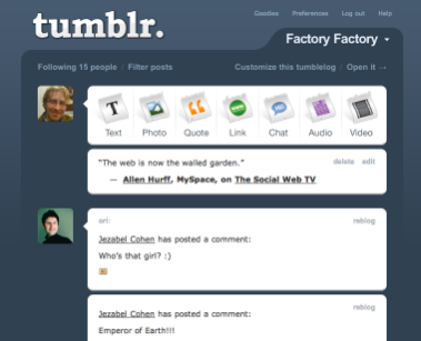
Tumblr does a great job of using gradients to get the best of both worlds, nice design and visual seperation. In this picture they start off with a very dark blue on top of a light background. Given that it is a tabbed section this allows the user to still get that tab effect and know that each tab contains different contents. However the cool part is how Tumblr eventually integrates the entire section back into the site by having the end of the gradient match the background.
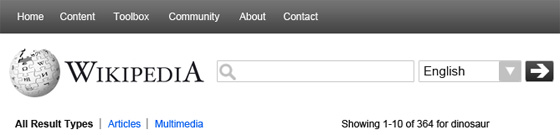
Here is a before and after of my Wikipedia mock up to show you how this technique helped me ground, separate, and design the Wikipedia redesign search area.
Before
After
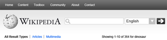
This grounded the search bar, and made the overall look appear to be less ‘floaty.’ This helps prevent the user from experiencing any visual distractions.
Whenever you feel like you are abruptly interrupting the visual flow of your content, if content just appears to be floating, or it feels like it is becoming too obvious that it is separate when it is not necessary, try using this technique.