Interaction Design Concept w/ Zerocater's Website

Zerocater is a company that aims to make ordering food simple. When I approached this design simple and minimal always ran through my mind. I tried to break down each essential component to the ordering process and make it as easy as possible. Lets begin with sketching the overall user flow. I used Ryan Singer’s shorthand ui flow sketch methodology.
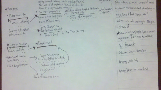
This gives me an idea on what aspects of the interaction I need to design. By walking through how the user achieves their goal, I can begin to create tasks that will help them get there. You can see this in play right from the beginning when I ask the user to enter the city they are in. As I worked more with the app and wanted to make it as simple as possible, having them enter the address where the food would be delivered seemed best. This prevents an extra form field that will need to be completed in the future. This will also help if the user decides to custom select their food rather than using the default Zerocater way of letting them decide what to send. After this step I write what the user sees, Enter # of employees, and what the user does. Again the user flow allows me to zone in on that specific interaction and what happens around it. This is where I can start to put myself in the users shoes and try to answer questions they might have. Things like how much will this cost? How do I customize an order? How long will it take? Are questions I might have to answer. My first thought when it came to having the user fill out form fields was I wanted to make it feel easy and quick.
Steps are a good way of letting the user know that a process isn’t too long. It also helps inform the user of what will be required to reach their goal. When you enter a # of employees (try it here) there is instant feedback on how much it may cost. Not only does this help satisfy a question that may be on the user’s mind, it also creates interaction and that feeling that things are happening. Some user’s may try varying numbers of employees just to see the price move. It also reinforces the general quick and easy theme of how the site will operate. I chose to use a slide down for when user’s have special dietary needs. This reduces the amount of form fields required to complete the task and introduces more form fields to the user after they have already completed a bulk of the requirements to make an order. The thing I don’t like about the current layout is how it defaults to one order. There are a couple of ideas on this. The reason why I set it to one order rather than multiple as a default is to keep it simple. Also it made sense that a company would want to try something like this before diving head first into a longer commitment. Psychologically, defaulting at one time order reinforces the idea that people only order one time. It also discourages them slightly from trying a multi-day order. Overall this might be something that would be tested in the future. Lastly, I would have the option to ‘custom build’ your order right before the final confirmation. This would state something along the lines of most people just let us handle arranging the orders but if you’d like to create your own, here is the option to do so.
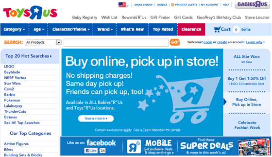
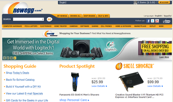
Custom ordering is always a nightmare, regardless of what is being sold. Here are a few examples:
Toy’s R Us
NewEgg
Even Amazon is rolling out a new page design, mostly to account for the shift in users browsing their site with tablet devices, but we are definitely seeing a trend towards minimalism and simplicity.
2012 Amazon Design
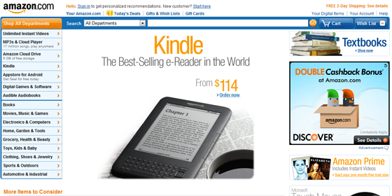
New Amazon Design 2012
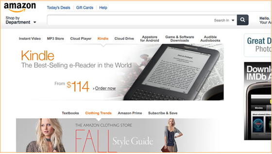
Amazon is known to religiously A/B test the different aspects of their site and have had several homepage overhauls in the past 10 years.
With the Zerocater custom food ordering page, I wanted to make it simple and to the point. I pushed away design elements, containers, and just got out of the users way let them discover good food. Here’s the ideation process:
First 8up Sketch
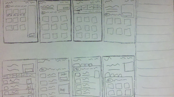
Initially I thought of combining different parts of the site to this selection process. Things like global navigation, tabbed sections, order summary, featured products, etc. As I sketched out all of these ideas and tried to simplify them, I felt that the product wasn’t in the spotlight.
Second 8up Sketch
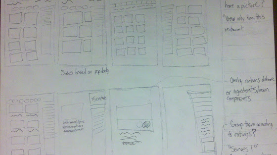
These sketches had more emphasis on the product/picture. I got inspiration from fashion eCommerce sites that allowed the user to discover new trends and clothing. There should be minimal text, not so little that they only know what they are buying based on the picture, but with just enough for the buyer to make an educated decision.
Here is the final result (some ajax image loader’s will spin forever because I don’t have images in place for them.)
Custom Ordering Page Navigation

I organized the information architecture to display types of food by culture, food group category, and by restaurants. Restaurants are revealed with an accordian UI once the user clicks a cultural food type. In terms of food discovery this made the most sense giving users a chance to discover different foods from different restaurants as seamlessly as possible. Since the site is so image heavy, lazy loading images would be the best way to go for the user experience. The site layout is fairly easy to learn. As the user browses the site they will pick up the functionality quickly since their are minimal features.
Initially I wanted the side navigation to be on the right side. I find that a majority of sites with left navigation are instantly ignored. However, the left nav is one of the only ways to navigate this section of the site so it isn’t so bad. The main determining factor though was an idea of having an order summary ‘pull out’ at the top right of the screen. This would help users add orders, keep track of how many people they ordered for, and make sure they have all special dietary meal requests covered.
Most of the sections and features I mentioned above were for users that weren’t logged in, lets look at the dashboard for when a user regularly uses the service and is a registered user.
Like always, I started with an 8-UP sketch to explore different ideas.
Initial 8-UP Sketch
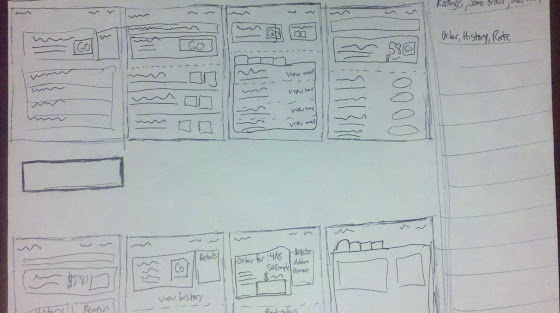
One of the bigger focuses I had during process was to highlight the latest order, sometimes making it have its own section. The more I questioned that idea the more I realized it didn’t have to take up so much attention. Having a big, update/change your order sends the wrong message. Given the way Zerocater operates, the user should feel that Zerocater has everything covered and that there is nothing to worry about. Here’s a 6-UP sketch I did to investigate some ideas further.
6-UP Order Dashboard Sketch
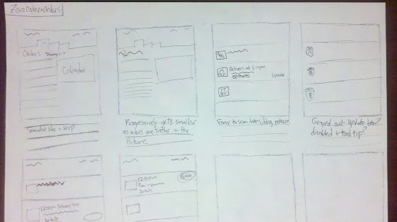
You can see that I start to focus more on lists and simplifying the entire message/process. Once I had a better idea I created a 1-UP sketch and went straight into production.
1-UP Sketch
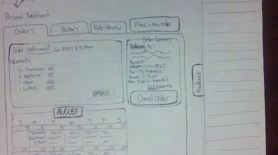
Once I started prototyping, I noticed a few more areas that could be consolidated, simplified, and contrasted. From the very beginning I intended the calendar to be a quick reference check for the user. I wanted them to be able to see what days they had orders for at a glance. This would help prevent the catastrophic failure of a user forgetting to place an order. However since the user would not be using the calendar to make orders day by day (Zerocater is trying to simplify this process tremendously to avoid that) the calendar should not play such a large roll on the page. Here is the webpage that resulted from those changes.
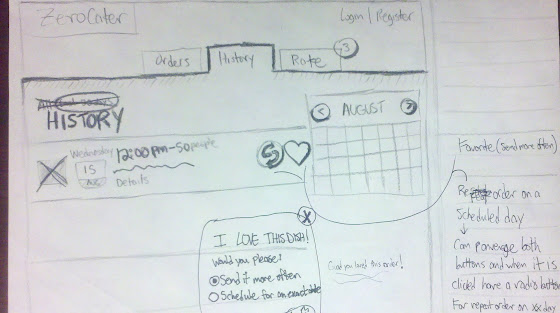
The history tab originally looked very similar to the recent orders page. Prototyping and sketching helped me decide upon a ‘skinny list’ to allow the user to browse through the history as quickly as possible.
History 6-UP Sketch
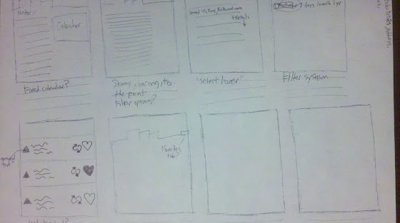
Exploring some history features
Finally, reviews play a big role when it comes to figuring out which restaurants are good. By crowd sourcing reviews, Zerocater has the potential to discover trends and sort which restaurants to continue to work with. I didn’t want reviews to feel tedious so I avoided the skinny list feel that you experience on the history tab. I instead went with a larger list that contained illustrations. The food illustrations are meant to be fun and help the user quickly register what type of food/restaurant the review is for. The large stars are supposed to give off a playful feeling, to encourage more reviews to take place. You can definitely see more room for discovery in this section as you allow the user to look at other places people are rating/reviewing and allowing them to comment on restaurants or specific dishes. The red notification on the Rate & Review tab is a subtle reminder for users to interact with the reviews section.