Interaction Design w/ a Redesign of Justin.tv's Employee Page
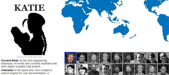
I wanted to make the Justin.tv page fun, interesting, and more relevant to what they do. If you haven’t guessed by now I chose to go with the Street Fighter 2 character selection screen when choosing to learn about the people who work at justin.tv. It serves two purposes, first and foremost to reinforce the video game culture that embodies what they do and what their users love. Here’s what it looks like. I felt looking at the old page being black and white and only featuring 4 employees was a bit bland in terms of learning more about a company and its employees.
The second purpose was user engagement. I wanted anyone who visited the site (current employee or potential employee) to truly learn about the people at the company. In the workplace all it takes is knowing a little thing like someones favorite food, place they want to travel, or general interests, to spark the beginning of a great relationship. I feel the same applies with someone looking to work somewhere. If the employees seem personable or as people they can relate with, it makes it easier for people to fall in love with the idea of working there. If your going to spend 8-12 hours a day doing something, you better love what you do or the people who are in the trenches with you. Overall this page functions as both an external and internal tool, to learning more about the people who work at justin.tv.
Let’s look at how the layout and interactions were created:
Initial Ideation 6-UP Sketch
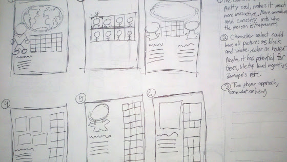
The page functions just like any character select screen in a video game. I started out with a blinking cursor/fade in fade out effect to alert the user that they could interact with the portraits on the page. This is a common video game character select pattern. When designing interactions or features on a site be aware of what interactions/experiences your users are familiar with. I debated constantly about how the “re-select character” interaction should work. This is where my sketches helped clear up the several ideas I had.
Best concepts 1-UP Sketch
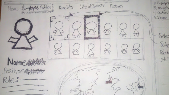
Interaction sketches
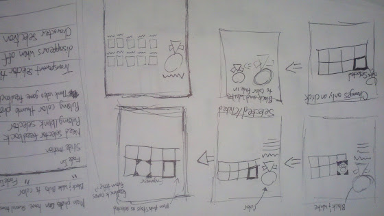
While hovering through the characters, the user would notice that the ‘main’ character’s portrait on the far left would change. This further reinforced and gave feedback to the user that a selection process was occurring. The portraits are pure black to give the user that feel of mystery and curiosity in finding out who the person is. If this were made for production though, rather than being pure black, the images would be larger black and white pictures of the current person you are hovering. This would be better usability wise because it would make it easier to find who you are looking for. We will revisit that idea soon so let’s get back to the ‘re-select character’ interaction. I decided on the idea that once you select a character, their image would stop blinking and their thumbnail would outline in red, indicating that the character was selected. This part was fine but what came next was the troubling part. In a video game, once you select a character the screen locks it in and you have to press B or something to de-select your current character. This is fine on a controller with only 7-8 buttons that is physically in your hand, but not on a computer where the left click is predominantly the only thing people use to interact with the screen. I decided on still enabling the hover effect on the thumbnails to blink with a blue border. However whenever you hovered over the thumbnails, the main image would not change. This created a disruption in user feedback, and was discovered once I did a usability test with a friend. He literally said “Is this broken?” Which was beautiful because in my mind it made perfect sense how it worked, I built it. He was used to any hover effect changing the current character so when it was only blinking on the thumbnails and not changing the main portrait he thought the site was broken. My main concern for designing it this way was that I did not want the ‘selected character’ content to be disrupted if the user happened to hover over more thumbnails. After testing with my friend I came to a better solution that reverts back to the selected character as long as the user is not hovered over any new characters. I am basically relying on the user to learn subconsciously about how the product works. Kind of like this: “If I hover over any thumbnails I can choose a character. If I am not hovered over any thumbnails, I can read the bio/details of the selected character.”
That’s why it helps to prototype extremely quickly and get your product/idea in the hands of others. The users will tell you how they thought something should work if there is an error in the current process. Rather than deliberating for hours conjuring this grand scheme of how someone will use your product, sketch out the idea (quickly), code it up, and get it into an actual user’s hands.