Lessons from Nature Part 1: 3d space
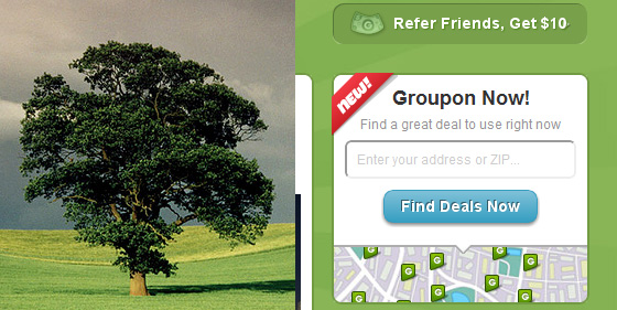
Photo credit: Tree by Helen Rickard
I have been going on daily jogs lately which have been helping a lot with my energy levels, I highly recommend it if you feel somewhat sluggish after 6 hours of work. Anyway, after I was really tired and maybe partially delusional from the lack of oxygen to my brain, I started to REALLY take in nature. That’s when one tree really stood out to me. As I looked at it, it became the forefront of my perception. As I stared at the tree trunk, I still had vision of the other trees and grassy background, but my main focus was on the size, color, and details on that tree trunk. Going back to websites, this reminds me a lot about a technique many websites employ. Maybe some of them do this for aesthetic reasons but there is a very good case for differentiating content by making sections appear to ‘pop’ out of the background.

Groupon uses this layout very well. They use it for notifications, bringing to light extra features, and other deals. Due to the 3d nature of the site, the user doesn’t feel overwhelmed by the information because it only goes as far as the section goes. This allows users to orient themselves very easily, and browse over different sections.
One other crucial thing to point out is how Group has the Buy now arrow break the layout. This is a technique that is used to draw attention to the main CTA’s, or what you want your user to do. It is a good way to improve conversion rates since the eye can’t avoid the one thing that isn’t uniform with the rest of the site.
Those were a few positives of doing this style of design, in my next post I will go over the negatives by going over a counter example, free flow design.