Lets make it easier to find flights on Kayak
Lets make it easier to find flights on Kayak
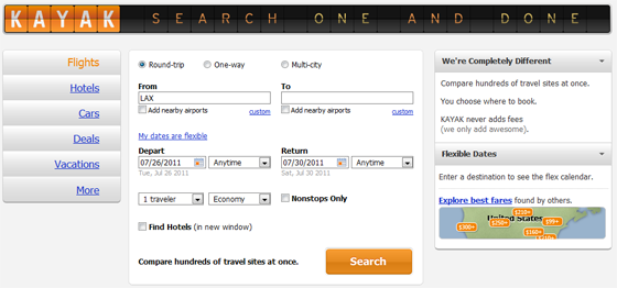
Kayak is one of the best designed travel sites these days. It doesn’t have all the clutter and tricky ad’s that most travel sites employ to trap their users. Hipmunk is another site that comes to mind with the same philosophy. Yet as always there is still room for improvement.
I wanted to recreate a better experience by approaching it from the user’s standpoint first and business motivations second. Contrary to most common thinking, all of these travel sites margins primarily come from everything but the airplane ticket. Since so many companies aim at selling cheap tickets, margins are made primarily on the finder’s fee from hotel bookings. That was going to be a key point for the business side of the design. How can we get the user to have more propensity to book hotels through us? With that in mind, how can we still make the user’s life bliss of finding a plane ticket seamless and easy?
Strategy: Cut out all of the noise when it comes to purchasing a plane ticket. Focus on the thought sequences of the user and optimize the design layout to accompany that. Make the ability to search for hotels more visible.
The first question I asked was: What does a user think the moment they need to book a flight? There are a variety of users that use these sites but the two most common would be the ‘general public’ looking for cheap flights, and businessmen that don’t fly first class. The way I came up with this is if you look at the SEO strategy on Kayak’s main site you can see the word ‘cheap’ a multitude of times and that is also how we search in our mind, “How can I find the cheapest ticket?”
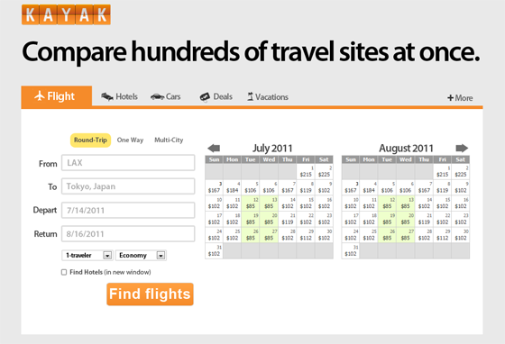
Innovative Feature: When searching for tickets online, the reason we use these sites are so that we can compare and try to get the best deal. Kayak already employs a pretty cool method of ‘quick’ price checking by having a calendar that populates the best deals purchased in the past 48 hours based on your depart and arrival location. The problem with the way Kayak has done it is it didn’t incorporate it into the date selection process. If I am going to shop based on price, I shouldn’t have to go back and forth between the calendar and arranging my dates, I should easily be able to just click to select which dates I would like to go on. When searching multiple days, this small change starts to show its true colors as it minimizes the friction of comparison shopping. Unfortunately due to the amount of Javascript necessary I have not included a working model of that, but hopefully I will have that done in the near future.
I changed the menu items by adding a tabbed style with icons. This should hopefully encourage more interaction with those search options once the user sees how seamless it was to find a flight. I also reduced the amount of form fields for the same reasons.
Lastly the original motto “Search one and done” was catchy/chic but lacked a clear value proposition of why the user should use Kayak over its competitors. That’s why I made the headline their other motto “Compared hundreds of travel sites at once.” This is much more powerful and spans across more than flights because it contains key words that are inline with the process the user is going through.
I still believe the site has a lot of room for improvement. Things like graying out the dates before today’s date(if applicable), as well as adding indicators for the selected timeline of departure and arrival. What you saw here were the key features I felt could improve the user experience and turn Kayak into a destination where comparing price has never been easier, for anything travel.