Occam's Razor, the UX interpretation
Occam’s razor, the law of succinctness or “the simplest explanation is most likely the correct one.” The way I look at it is how can you break something down into its simplest nature before racking your brain with a ton of What if’s? I’m not saying that What if’s are bad, in fact, a lot of innovation comes from asking what if. Unfortunately asking what if also causes you to stray away from your original goal of developing the web app.
Sketching is the best time to unleash your creative process. It doesn’t cost much to scribble something out and move things around. Once you get to the development stage, if you haven’t sketched your ideas out enough, development and design times can start to compound. This is when it becomes very important to focus on the core problem, some call it MVP, and reduce the amount of features to what it takes to get the product out the door. An example I experienced was with designing this new tutorial wiki site. The problem I was solving was that a lot of tutorials and books become outdated and unusable because authors miss certain crucial steps.

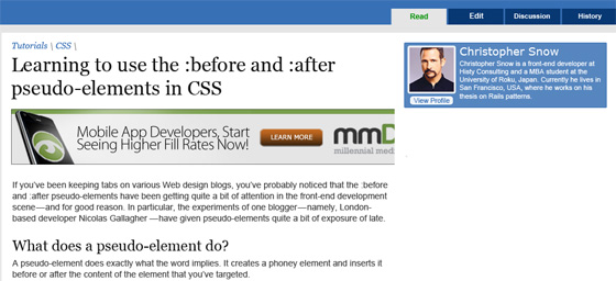
The part I contemplated about was a feature. From this picture you can notice a lot of white space. Now most would just fill this up with 150×150 Ad’s (which will probably be the case for 2 slots) but after that there is plenty of room to enhance the overall product. I wanted this portion site to act how footnotes act in books. The footnotes should enhance the tutorial, but I’m not sure exactly what type of content will go there, links to related videos?, links to external blogs that go in depth, links to real life examples? Some might even say why not just have those incorporated into the original tutorial since it is a wiki anyway? That may happen, but I also feel a tutorial should not distract you from learning the specific concept it was made for. Ultimately my goal was, how can I use annotations and this side bar to enhance the current tutorial content. I had a lot of ideas flowing in my mind like being able to add small icons inline with the text which would indicate that there was more support to learn the information, or adding the icon to the end of every line that it applied to. Things about branding came up, like the icon would become a universal symbol for extra external support on a subject/topic, more than an external link. With ideas like that, the core issue starts to get complex but by thinking back to Occam’s Razor, the side bar is just extra supporting information. Sticking with a standard number annotation system could work, and have users explore what extra ‘support’ information helps them the most.
There are a lot of instances when our ideas get extremely feature heavy. If we think back to what something is at its core, a list of friends, comment section, etc. we can simplify our project and build upon it later. The last thing you want to do is overwhelm and scare yourself away from the project with its perceived complexity. The next time you feel something is getting extremely complex put it aside, work on its most fundamental, bare bones, ugly form and go from there. You will be surprised how clear the answer will come if you just get started.