Wikipedia search redesign contest Part 1: Initial design and thoughts
The more I attempt to redesign the wikipedia search results page, the more I see the potential in a full redesign of Wikipedia and the way it delivers content in general. In order to balance the concepts I am presenting, I feel there needs to be uniformity with the rest of the site’s features.
What is Wikipedia? A free encyclopedia that is editable by anyone.
What is Wikipedia’s goal? Taken directly from their site “Our mission is to empower a global volunteer community to collect and develop the world’s knowledge and to make it available to everyone for free, for any purpose.”
Who are its users? In a nutshell, people who love learning and have a lot of intellectual curiosity. Students, academics, and people who are searching for descriptions on a topic of interest.
What are the users goals? A majority are searching for quality content that helps them understand more about a topic. Some users like helping wikipedia become a better resource, having academic discussions, and want to improve the world’s collective knowledge. A lot of these users edit articles and regulate content.
Going with this general criteria I started doing research on UX Design for search results. Studying the top 3 (Google, Yahoo, Bing) also helps to understand the psychology of what each finds important when it comes to search. The Wikipedia search results page is interesting though because it isn’t a global search of all the web like those 3, it is a search results page that depicts what is in Wikipedia. This opens the doors to a more targeted design that can only be defined by the User’s goals and motivations of using the Wikipedia search.
There was a lot of debate on the fact that no one even uses Wikipedia search, they just go through Google. Which is true for a lot of people since their gateway to Wikipedia is usually because it is a top hit in Google searches. There are also a lot of people who access websites by typing the website name/url into the search box. So it is still possible for people to arrive on Wikipedia’s homepage to initiate a search. There are also people who specially want content from Wikipedia given the nature of its ‘academic’ results vs. what they might get on Google. The Wikipedia search page also directly brings you to an article or a lousy search results page if it doesn’t have data for your query. So how can we redesign the Wikipedia search result’s page so that it provides more value and becomes a more attractive solution/medium to use while on Wikipedia?
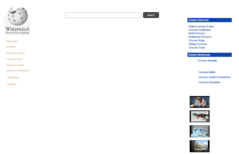
Here is my initial design. Normally I design inside out starting with the main content and working out to features. However with this design, I wanted to get the features out of my head to start seeing how they interact with the page.
The layout is very similar to any of the popular site search pages using a 2-3 column approach with a very obvious search bar. Then I placed a related results as well as related multimedia in the right column. Before I go in to detail as to why I chose those 2 features I have to go over why a user would even search on Wikipedia in the first place.
Going back to the goals of the User, I started to think about how primarily I could help them find the content they are looking for, and as a secondary help them find related content that they may find interesting or were not aware of. Features like related searches and related multimedia help with the latter goal. The primary goal does not seem to be that hard to achieve, the way the current site is set up, you are directed to an article straight from your search, so Wikipedia has a good idea of what the top result should be. A lot of the content that people are searching for are people, historical events, and other things of that nature. For example people aren’t asking a question as a search query in Wikipedia, they are doing that in Google. So Wikipedia already has a general type of content that people search/use it for just like a real life encyclopedia. This concept plays a huge role in shifting one’s paradigm about how to design search for Wikipedia.
When researching about a topic you know little about or are interested in, one of the first things you look for is a definition or summary on what that topic is. Wikipedia’s current article layout also starts with this assumption. Search results should also fulfill that first user goal, and then lead them into finding out more information. If someone searches Mount Everest for example, one of the things most people are looking for is probably how tall it is. Giving them the height in both scientific units and physical comparisons that they can relate to helps the user obtain what they were looking for immediately. After this, the user has secondary goals which could be to find other interesting facts or details about Mount Everest. This is where having an internet encyclopedia can play a huge role. Multimedia is another form of content that users love to consume. Images are very easy/quick for people to process. Videos and sounds can create more interest and further engagement with content. This is why I created the related Multimedia section, this could include interviews about people who climbed Mt. Everest, actual clips of ascending Mt. Everest, extraordinary pictures, infographics, you name it. With the previous Wiki search, you would be taken to an article immediately. With my idea you would be met with a slew of content that you can choose to consume, whatever interests you the most and is still relevant to what you are searching for. This is also where the related searches come in. A user can start by searching Mt. Everest but be met with more related searches that zone in on content that they were more interested in after getting the facts up front. That’s the difference between the advantage of a search done through Wikipedia vs a search done through Google. The search through Wikipedia can deliver you the stone cold facts right up front and then target you with other content that you may be looking for. Google on the other hand provides you with 12+ sites that are all on information about that search, hoping that one of the sites will provide all the information you need but once you arrive at the site, you have to find that information yourself.
Now I start to wonder, does this need to be an extra feature in the right column? Can this just be incorporated into the core search results? Perhaps just have sections like Bing and Google does with Images and Video within the core results. Those are definite possibilities. If I do go that route I have to think about how much weight they get and where to display this content. How to differentiate the sections, how to set priority in terms of ranking and relevance.
That is where I currently am at. Designing and thinking about what the core content should contain. Will the first 5 results be purely article related? Contain one result with 4-5 image thumbnails, or even videos? Ultimately I feel search plays a much different role when done on Wikipedia compared to any other site. Wikipedia’s left nav also plays 0 role in aiding search, so that is another thing to think about. My current idea is to push the nav to the top and create mega drop downs when hovering over certain items. The awareness of the donation button should be enhanced as well.