Wikipedia search redesign contest Part 2: Results design and adjustments
With search becoming a more prominent part of the Wikipedia experience I attempted to make it more prominent on the page and more simplified. One of the highlighted things is the left navigation, re-organized and moved to the top. There is a lot of potential in providing more usability with the top nav. It also avoids from making the content on Wikipedia feel cluttered. Since Wikipedia has a lot of deep architecture built into the links, I am hoping to mockup how well a mega drop down could do for them.
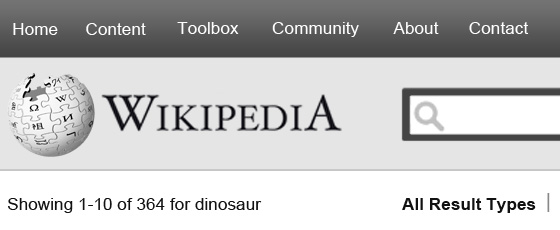
Current Wikipedia search bar

Redesign

At first I was designing the search bar with just English speakers in mind, but then you have to remember that wikipedia is a big international site. Not every guest will be searching in English. Another important aspect is that the search field isn’t super long like Google’s. People (currently) aren’t typing in huge queries on Wikipedia. Also since it is a dual input search bar (you have to select a language if it is not English) the longer the initial search input bar, the more work the user has to put in to change the language.

Here is the overall current design I have. I kept the most important filter options, Articles and Multimedia, and moved all of the other options like Projects and 20 check boxes if you click advanced on the old wiki page to a simple link called ‘Advanced Search’ to the right of the search bar. The overall results definitely feel Google esque which is both good and bad. The bad part is it doesn’t make the design extremely original. I think a lot of designers will be playing with the typography a ton since 60% of the page are these result links and descriptions. However I feel to ignore Google’s layout would be a huge mistake from a business stand point. The amount of test’s Google has run on search usability is immense. I spent more time on understanding the Google layout principles and thought about how the user would experience the results. I added a few more characters allowed to the description so that users could skim and preview content a little more. I am probably overestimating how many users actually read the descriptions. I think their thought process scans the headlines first and then if something catches their attention they will read some of the time before proceeding to click. I also included the first four content sections as sub links (if the article had any) within the search results. This should help users get to the section that most interests them more quickly. The problem with this method though is the context of those section titles might be a little plain. I changed the color of the blue on the headlines so that they would differentiate from the subsection links. The color plays a huge role in making the page look a bit more original though so that is something I might play with more. It definitely pops out the most important content that the user seeks in its current state.
At the bottom of the of the search results, the 5th result is an image collage. This section will allow users to hover and check out different images while getting a content preview as to what section the picture belongs to. Although the current placeholder image is from Qwiki, I hope to make a more refined collage full of color rather than black and white.
Lastly, the right hand column. The simplicity of it is very nice, it isn’t hard to decipher and the user should understand what it is immediately. The current amount of white space that exists between the main content and the right column could be a bit wide. Since the right content is very relevant to the search results, being in closer proximity would make more sense. The large amount of white space and video images on the right I feel make it more irresistible. If it weren’t for the images though, the right side would feel like fluff, kind of like the feeling you get when searching on Google knowing the right side is just ads. Since users normally thing these are ads, the design might need more Wikipedia branding to ensure that these results are indeed all Wikipedia based and not outbound sites. That is one thing I am currently battling. Users look at search results pages as gateways to external content, whereas Wikipedia’s would serve as strictly internal content. I think users are very accustomed to this layout and would have to feeling that some of these link to external content. I am debating some ideas on how to relieve this besides placing en.wikipedia/wiki/Dinosaur in green text at the bottom of every search result.