

Hi there! I'm Joseph Anderson and I'm a Product Designer that's obsessed with SaaS, Rails, Mobile, Marketing, and lentils. I'm currently day dreaming in San Diego, working on MightyScout, and experimenting with Sales and Marketing from a product design perspective.
First week as an instructor at Codepath
Last time I wrote one of these it was about learning mobile in 8 weeks. I wrote three posts about the first three weeks but I did end up finishing the course last year. This year I am teaching the iOS For Designers course at Codepath. Here are the...
At least you get paid for it
As I was walking to work in SOMA Friday morning I saw a guy carrying some drift wood. I didn’t think much of it, but as I passed he asked me if I knew of a good place for breakfast. I told him about a spot near my work and that it wasn’t too far away...
Disappearing Pixels
I’ve been thinking a lot about being a designer in this day and age. With things like Oculus Rift, Apple Watch, Bitcoin, and Mobile leading new tech trends, I constantly think about where we stand.
I think a designer’s job is to make things understandable...
1 Day in Milan
We arrived in Milan! Half of us took a van that was prepared for us by the Airbnb host. David and I took the train and saw some of the sights. It was tricky getting used to their train system, but we only ended up using the train once, since it’s a...
4 days in New York
It was super cold. It’s 50 degrees normally around this time of the year. We were greeted with rain and 25-35 degree weather. After getting out of the plane we met up with Andrew at the next terminal. Then we had to figure out how to get downtown to...
Wildcard might have a bad time
I’ve been a fan of Wildcard before it launched. The concept of cards on mobile is a very powerful one. There is just so much context when presented that way. It’s also consistent with different forms of content. Think about mobile apps that have top...
Communication
Whether its sharing your ideas or feelings, so much can get lost very easily. When I was working on a startup I would watch companies take months to implmenet something I could do in days. I never understood why it took them so long, until I joined...
Empathy
As a designer empathy is very important. Being able to take yourself outside of a problem and see it from someone else’s perspective is something very few people can do as time goes on. When you work on something for awhile, you start to know it inside...
Meeting a specialist
Have you ever met a giant? The mythical beast that towers over you and might not spot you. You read about them in the fairy tale books but may not have met one. I have, and lived to tell the tale.
After learning iOS for the past year, I’ve always...
The $100 bet to blog
I’ve been wanting to blog consistently for a long time. I think it’s a great way to get better at writing and expressing my thoughts. I have a lot of topics stored in Evernote that I need to write about, yet I haven’t written a single post on my personal...
Location and elastic networks with photos
So much context to a photo: date, time, location, weather, number of photos.
So much context to time: mornings, afternoon, night.
So much context to a location: venue, city, country.
So much context to temperature: hot, cold, rainy, windy, perfect
Learning iOS: Week 3/7 Homework
This week, we start to learn how to use custom data in our static views. Real apps will use real data, so we finally get a chance to see how things can look and feel as we get closer to dynamic data.
Creating Custom Cells
This was harder than it...
Learning iOS: Week 2/7 Homework
http://stackoverflow.com/questions/1785008/keeping-a-uibutton-selected-after-a-touch
Creating a login page Detecting form field validation Loading states for feed view Modal view slide ups UIScrollView for more content Alert and action views
Learning iOS: Week 1/7 Homework
Creating UIViews programatically Creating UIImage views Creating and positioning Labels Exporting assets from sketch Simple IBAction/Outlet
I started off Week 1 homework by programming the views. It required a lot of CGRect and absolute positioning...
The difficulty of learning mobile, fragmented tutorials, and what's working out so far
An overview on what I’ve learned so far diving into Xcode as a designer and front end developer
Mobile apps can be built in so many different ways. There are storyboards, nibs, and pure code approaches. As someone new to making mobile apps it can...
Mobile Design Concept w/ Weave
Weave is like Tinder for networking.
After playing with the app for a few days I thought about how it could be improved. Working on a startup myself, I understand what it’s like having limited resources. I wanted to focus on the core experiences that...
Your users have 3 brains, why do you keep ignoring them?
The more I learned about business, sales, and dealing with people, the more I started to wonder about how things impacted our subconscious. Lately I have become fascinated about our primitive...
Interaction Design Concept w/ Zerocater's Website

Zerocater is a company that aims to make ordering food simple. When I approached this design simple and minimal always ran through my mind. I tried to break down each essential component to the ordering process and make it as easy as possible. Lets...
Interaction Design w/ a Redesign of Justin.tv's Employee Page
I wanted to make the Justin.tv page fun, interesting, and more relevant to what they do. If you haven’t guessed by now I chose to go with the Street Fighter 2 character selection screen when choosing to learn about the people who work at justin.tv...
6 Key Design Lessons from a UX/Sales Perspective (website included)
3 Weeks ago there was a post made about 6 key lessons from a legend designer. First and foremost I am writing this article in hopes that start ups can take away that you can make a nice looking website that focuses on sales rather than aesthetics...
Wikipedia SERP redesign contest Part 3: Conclusion
The contest ended about 2 weeks ago and here are my final designs. I am going to go over the lessons and subtle design tricks I learned during this process. The key points I will discuss are text colors, interaction design, and why I designed or...
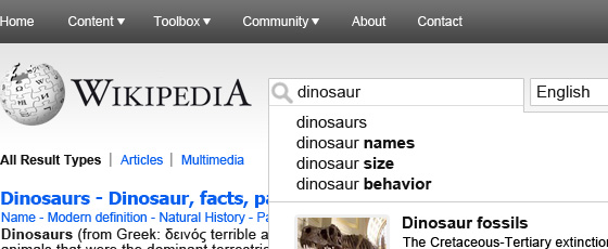
Wikipedia search redesign contest Part 2: Results design and adjustments
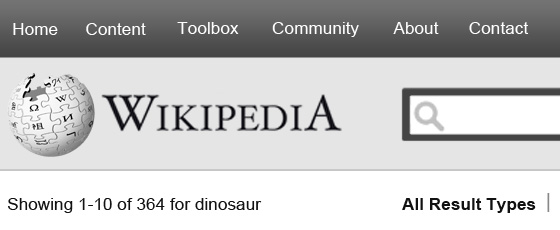
With search becoming a more prominent part of the Wikipedia experience I attempted to make it more prominent on the page and more simplified. One of the highlighted things is the left navigation, re-organized and moved to the top. There is a lot...
Wikipedia search redesign contest Part 1: Initial design and thoughts
The more I attempt to redesign the wikipedia search results page, the more I see the potential in a full redesign of Wikipedia and the way it delivers content in general. In order to balance the concepts I am presenting, I feel there needs to be uniformity...
Lessons from Nature Part 1: 3d space

Photo credit: Tree by Helen Rickard
I have been going on daily jogs lately which have been helping a lot with my energy levels, I highly recommend it if you feel somewhat sluggish after 6 hours of work. Anyway, after I was really tired and maybe...
Occam's Razor, the UX interpretation
Occam’s razor, the law of succinctness or “the simplest explanation is most likely the correct one.” The way I look at it is how can you break something down into its simplest nature before racking your brain with a ton of What if’s? I’m not saying...
5 things Universal Studios can teach us about user experience
I arrived at Universal Studios before rush hour and was greeted immediately by a simple offer. $15 for regular parking which has a farther walking distance from the park, or $20 for ‘preferred’ parking which allows you to park pretty much at the entrance...
How Six Flags committed user experience suicide
Dear Six Flags Owner,
From the moment we arrived at the park, the traffic to get into the parking lot was immense! I know it was rush hour, but rather than having thousands of cars wait in line to go through 8 parking gates, why not bring the parking...
Healthy cooking web app concept
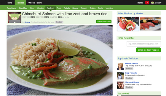
Food photo credit: Munchery Blog
The fundamental goal I kept in mind when designing this was “How can I find good/healthy recipes to cook.” I researched several sites and found what they lacked in and what they were doing well. Considering all of...
Context is king, use it when displaying images
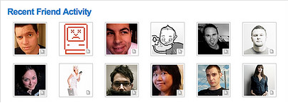
Whats wrong with this picture? Design wise it looks nice and clean. Experience wise it is utter crap. The original shows a list of about 30 people. The thought process goes like this ‘I have 30 friends who recently published some sort of content...
Be an early adopter and life long learner

Every startup that you have ever heard about is fundamentally trying to solve a problem/pain point…well hopefully. They are jam packed with creative ideas and strategies that founders have spent hundreds of hours pondering over. This is the perfect...
Educating first time users
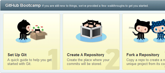
This is what you see as a first time user on github. It is a quick run down on the features of their product. I know I didn’t look at them in detail when I first signed up, I was too busy setting up a new repository. Anything else that github could...
Why you shouldn't use 5 star rating systems

See why youtube dropped the 5 star rating system to adopt the like dislike model.
What is the user experience like on the sites your users use most?
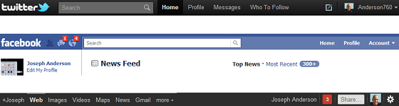
Take a second and think about the most used web apps today. Facebook comes to mind as one that your users interact with daily. This poses a huge advantage to you as the UX designer since you are familiar with the same product your users use on a...
How to prevent visual flow interruption with gradients
A lot of designers use lines of varying weight to differentiate content. These are instantly recognizable by the user but can get out of hand if used too often, and with too much weight (dark...
How can you make healthy food sites more appealing
It’s always been a pain when it comes to finding healthy and reasonably priced food. I have always had this idea that there are many recipes, spices, and cooking styles around the world yet a huge...
How Ryan Singer of 37 Signals designs UI flows

A very good guide by Ryan Singer of 37 Signals on How to design UI flows
Initial planning for CNN site redesign
The current state of any news site is overwhelming. A majority of the industry has just translated print practices onto the internet. With physical printing in steady decline, newspaper companies want to innovate...
Lets make it easier to find flights on Kayak
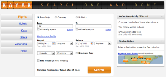
Kayak is one of the best designed travel sites these days. It doesn’t have all the clutter and tricky ad’s that most travel sites employ to trap their users. Hipmunk is another site that comes to mind...